A cannabis producer with a name, a provisional approval and nothing else. We drew the fox, then built the brands that grew out of it (Fox Tales, M-80, Firecrackers, Hi Lo, Tokh) and everything a dispensary buyer ever sees: packaging for every category, the merchandising that wins the shelf, the site, the sales kit, the screens above the counter, and the wholesale email that announces every drop.
Pioneer Valley had approval from Massachusetts, a facility going up, and a company name. No logo, no identity system, no packaging, no mascot, no site, no sales kit and no merchandising plan: nothing a dispensary buyer or a budtender or a customer would ever actually see.
We started as the brand and became the marketing department. It has not moved since. Seven years on, the identity, the packaging for every product category, the in-dispensary merchandising, the website, the sales collateral, the screen creative and the wholesale email are all still ours.
The fox came out of an exploration that ran through monograms, hop cones, a bee, a mountain badge and a script roundel before it landed on a line-drawn fox with an oversized tail. That mark had a harder job than it looked: it had to sit on a premium concentrate carton, a novelty infused pre-roll tube and a cannabis chocolate bag without any of them arguing with each other.
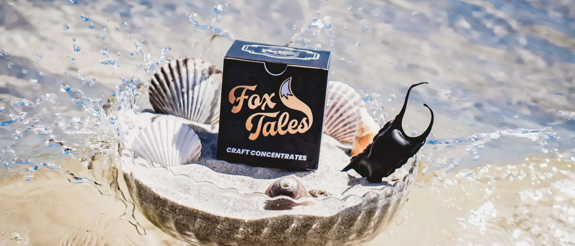
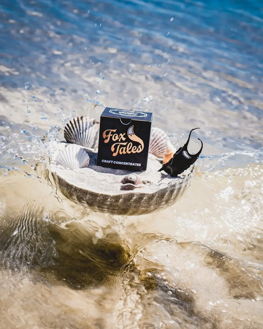
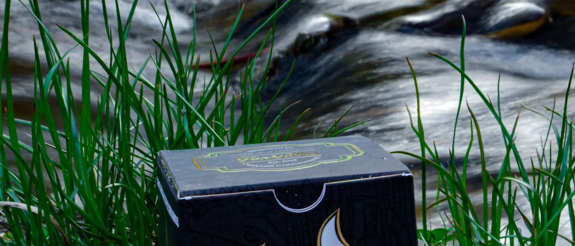
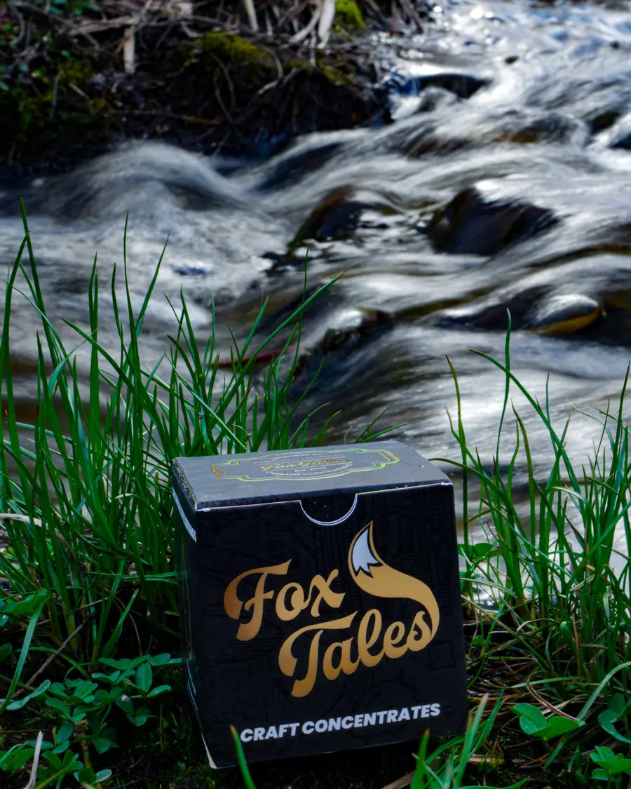
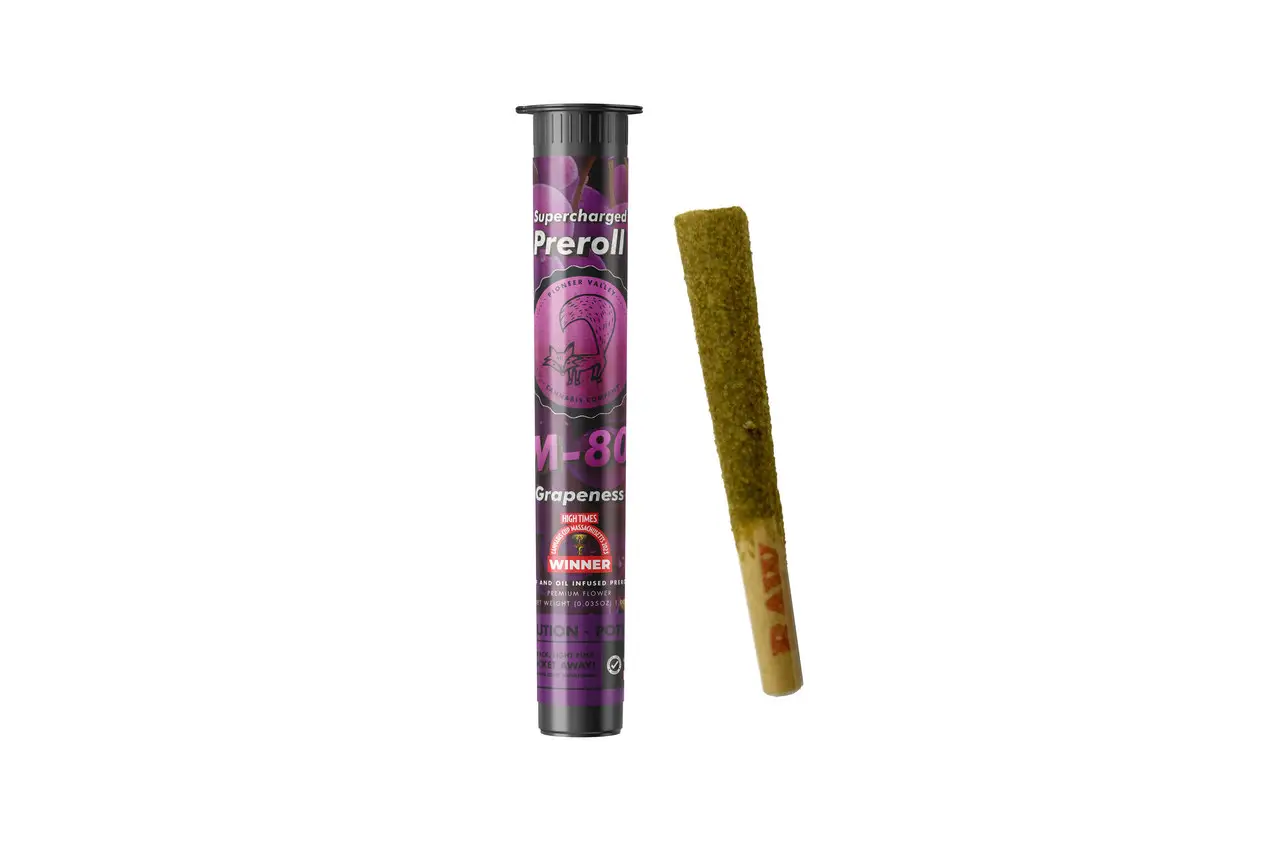
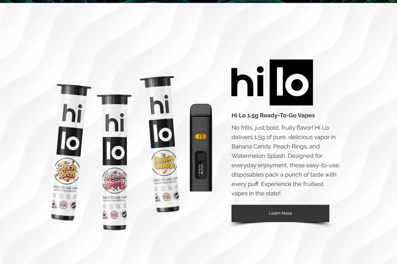
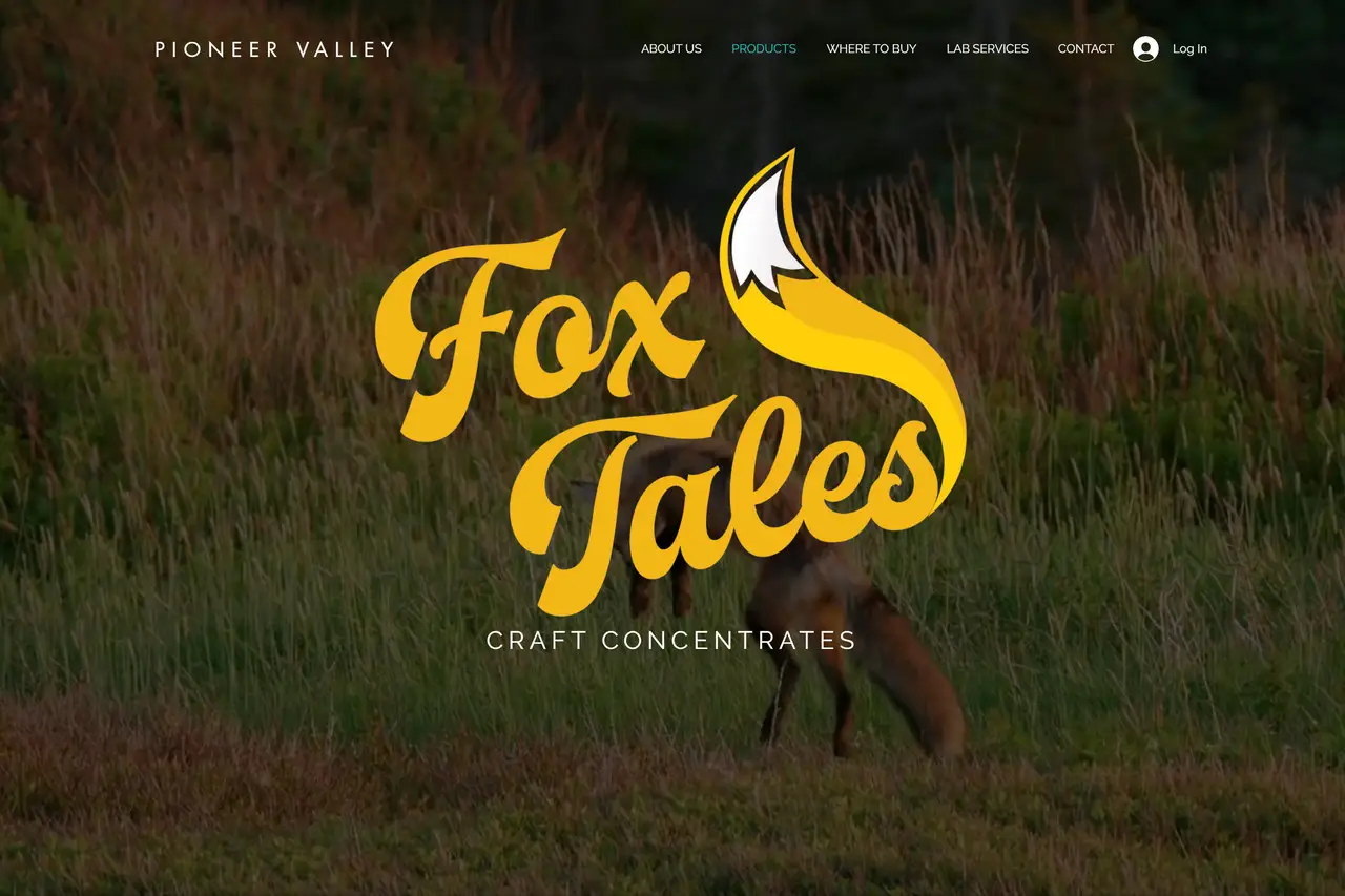
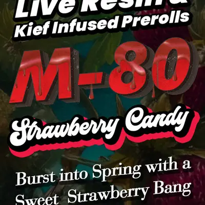
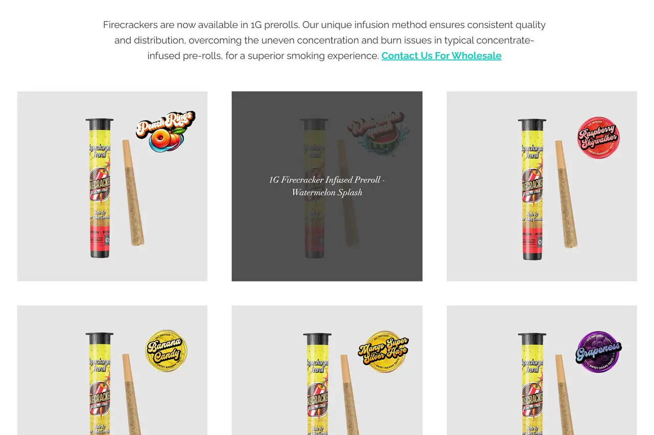
So the system grew a family. Fox Tales for craft concentrates. M-80 and Firecrackers for infused pre-rolls, loud where the house mark is quiet. Hi Lo for everyday disposables. Tokh for sun-grown flower, made with an outdoor farm outside Greenfield. Each one gets its own voice and its own shelf presence, and each one still reads as Pioneer Valley from across a dispensary. Packaging came next, then the merchandising that puts it in front of a buyer, then the site, the sales kit, the menu screens and the wholesale email: in that order, because that is the order a producer brand actually needs them.
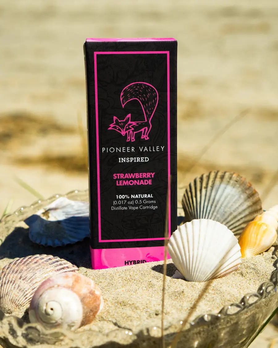
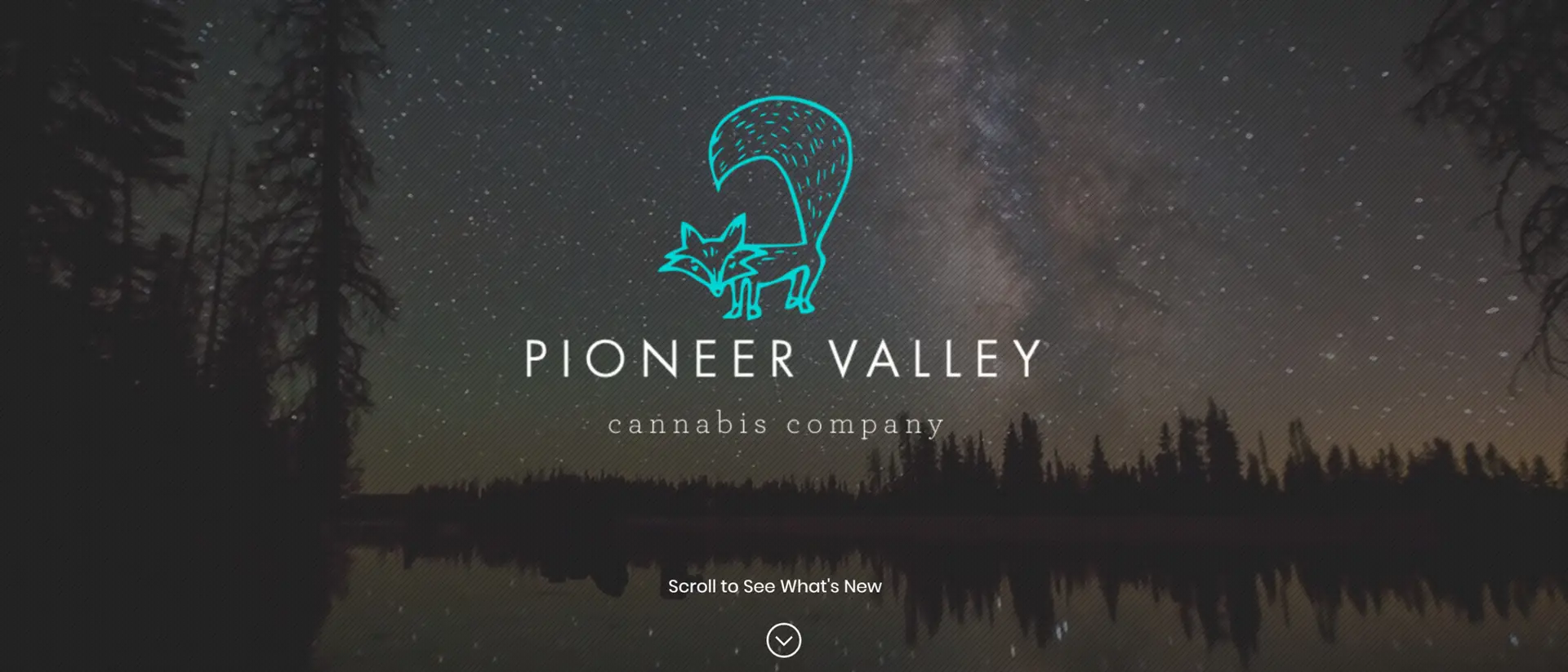
The house mark is a line-drawn fox with a tail bigger than the animal, set under a wordmark that stays deliberately quiet. Everything loud in the portfolio (the M-80 blast lettering, the Firecrackers fox in a red tailcoat, the Fox Tales gold script) is loud on purpose, against a house identity that never competes with it. The illustration system underneath, a night-sky New England landscape drawn in single-weight line, is what ties a chocolate bag to a vape carton.
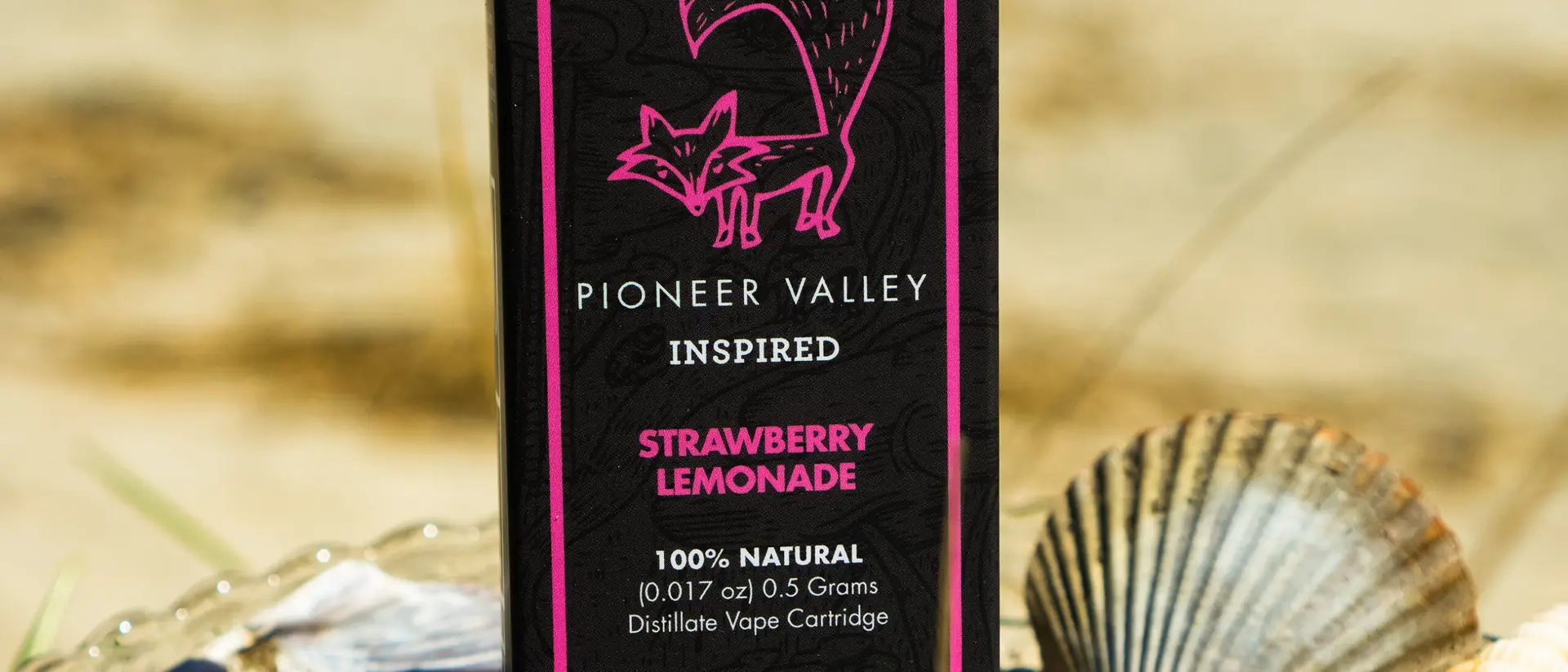
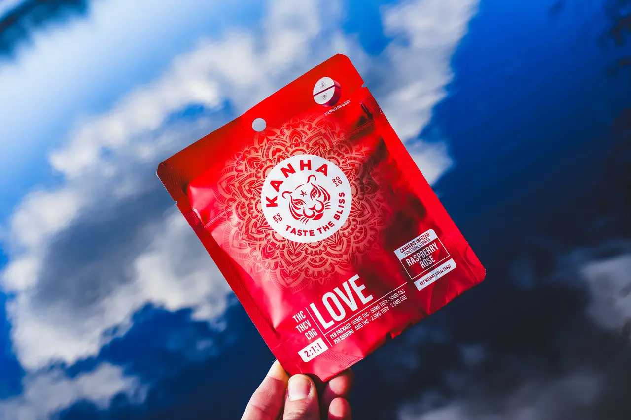
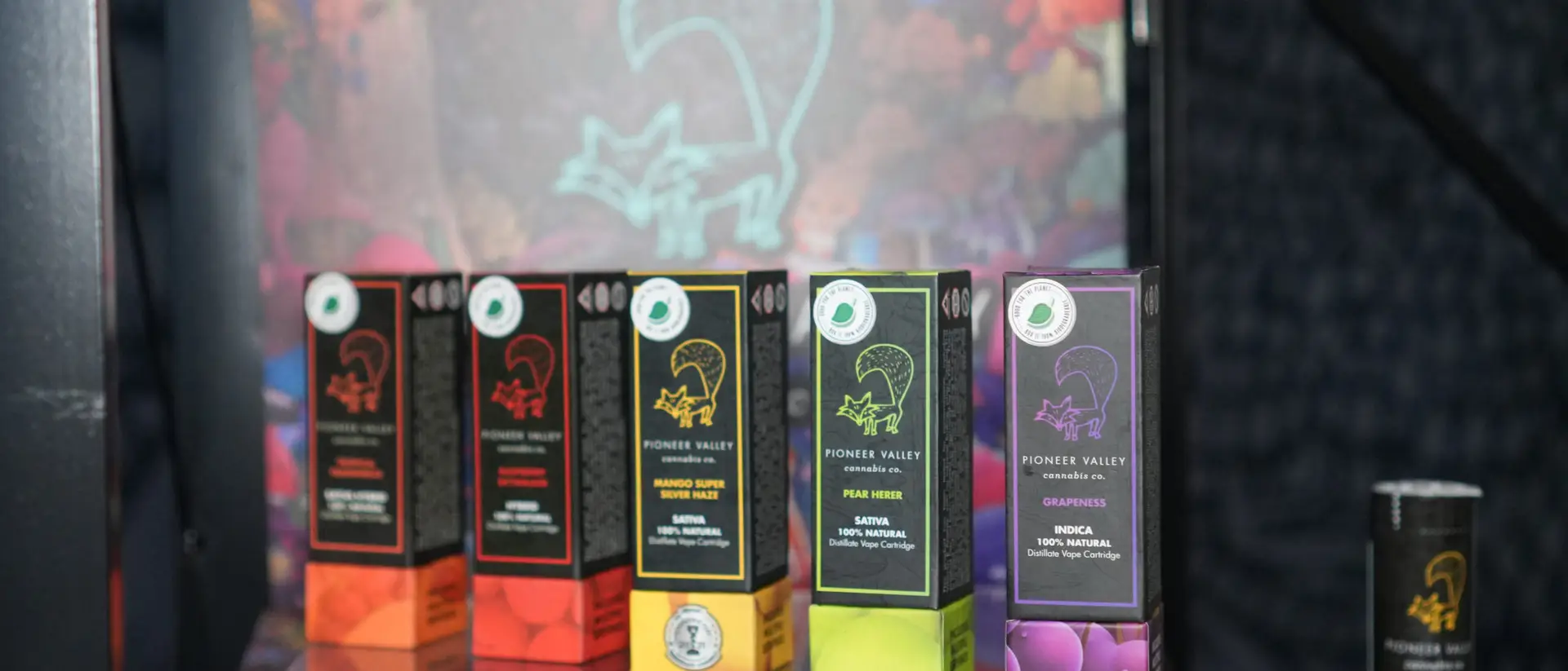
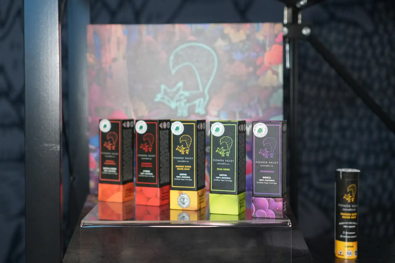
Vape cartridges in half-gram and one-gram, ready-to-use disposables, infused pre-roll tubes, mini pre-roll packs, concentrate cartons, chocolates and gummies: drawn, specified and sent to print here. The vape line runs on a color-coded fox: a different fox outline and a different base color for each flavor, so a budtender can pick Grapeness out of a row of nine at arm’s length. Pioneer Valley is also Kanha’s exclusive Massachusetts partner, and the Massachusetts product creative for that line is built here too.
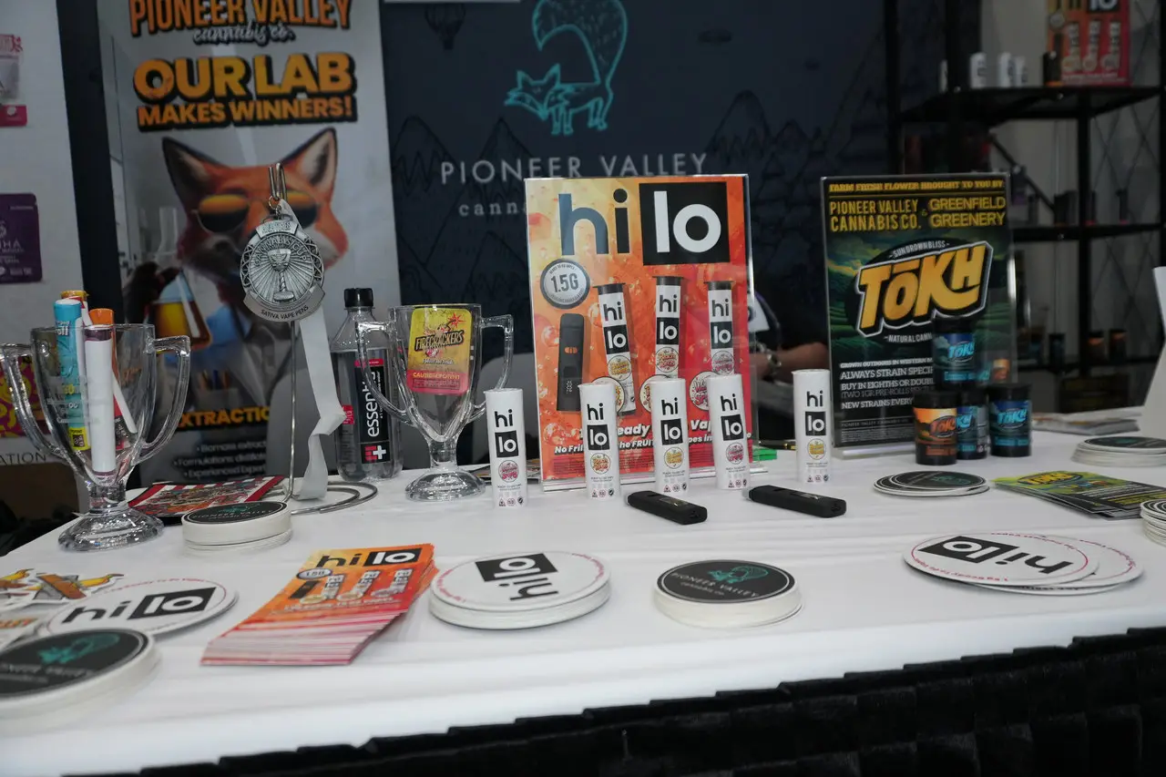
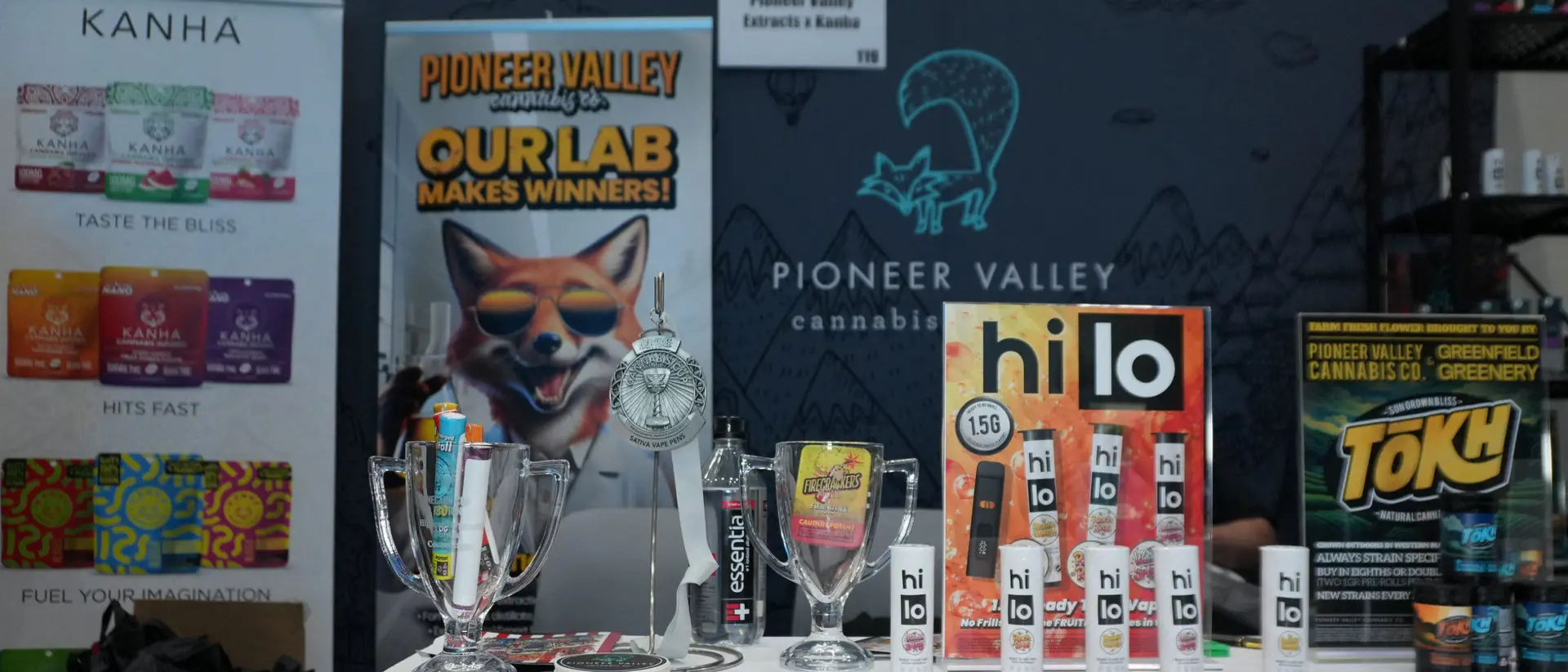
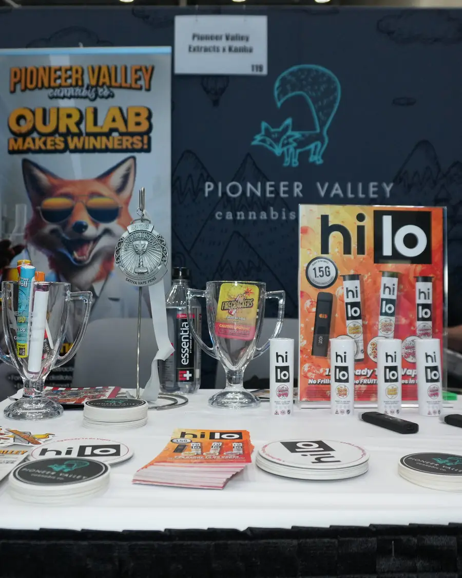
Acrylic counter cases built to the brand’s own artwork, lit product shelves, counter cards, table tents, coasters, stickers and the full trade-show environment: backdrop wall, pull-up banners, product racking. A dispensary buyer meets this before they ever meet a sales sheet.
Pioneer Valley sells to dispensaries, not to consumers, so the site has no cart and does not want one. What it has instead is a 27,000-pixel homepage that walks a buyer through the portfolio brand by brand and format by format, with the fox illustrated into each section and the animation carrying the scroll. Age gate, product line-up, where-to-buy, lab and extraction services, and a wholesale contact route on every panel.
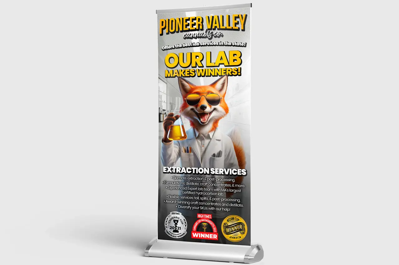
A printed product brochure, a table-top spec banner that lays out every SKU with its own dose, weight and description, per-category sales sheets for the pre-roll and vape lines, retractable banners for the extraction-services line and the M-80 line, and a large-format booth banner. All of it print-ready, all of it built so a rep can put the whole portfolio on a dispensary counter and walk a buyer through it without opening a laptop.
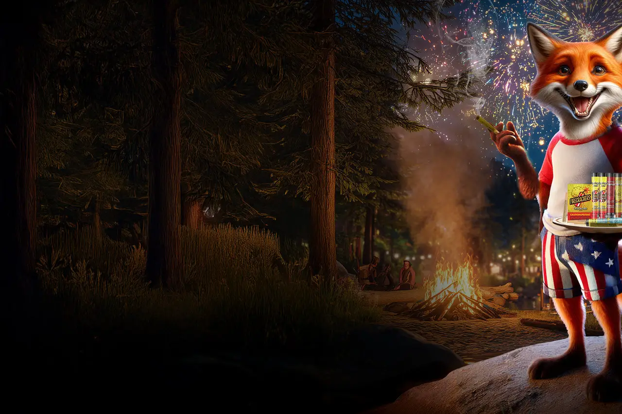
Dispensary menu boards are the last surface before the sale, and they move. Promo creative is built in horizontal and vertical cuts for the screens, animated banners are built to the menu platforms’ own dimensions, and the fox gets to act: drumming through a fireworks night for the Fourth, tumbling through a rain of popsicles for a summer vape push.
A wholesale email program aimed at Massachusetts dispensary buyers, not consumers: new-product drops, seasonal promotions, expo announcements, volume offers, and a buyers’ contest. The call to action is never “shop now”; it is “contact your account rep.” The design archive holds around fifty of these going back through 2024, which works out at one or two a month rather than one a week, alongside the maintained Massachusetts wholesale contact list and the company email-signature system.
Pioneer Valley is a category-leading Massachusetts cannabis producer, on shelves in roughly 85% of the state’s dispensaries, with a mascot the market recognizes on sight and six brand marks in all, the house fox among them. Fox Tales, M-80, Firecrackers, Hi Lo and Tokh all came after it, and all of them were drawn here.
The engagement is still running, and it has never narrowed. Packaging for every category, the merchandising and the trade-show environment, pvxtracts.com, the printed sales kit, the menu-screen and banner animation their paid-media partner runs, and the wholesale email to dispensary buyers: all of it ours, seven years in. It is one of the longest sustained relationships in our portfolio.
About running a cannabis producer’s marketing department for seven years.
We have built one from a name and a provisional approval, grown five more brands out of it, and kept the whole portfolio on the shelf for seven years. That is worth a conversation.